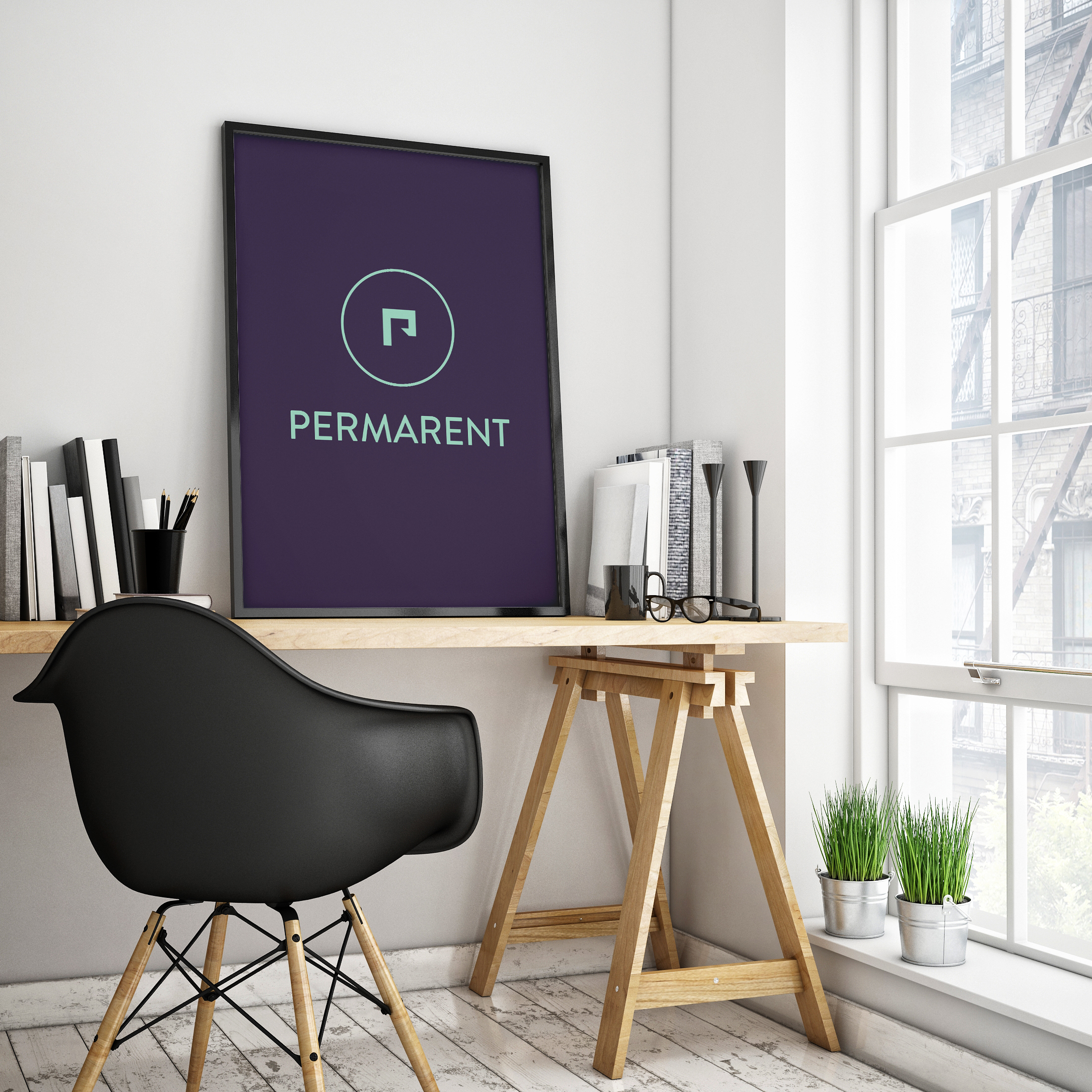
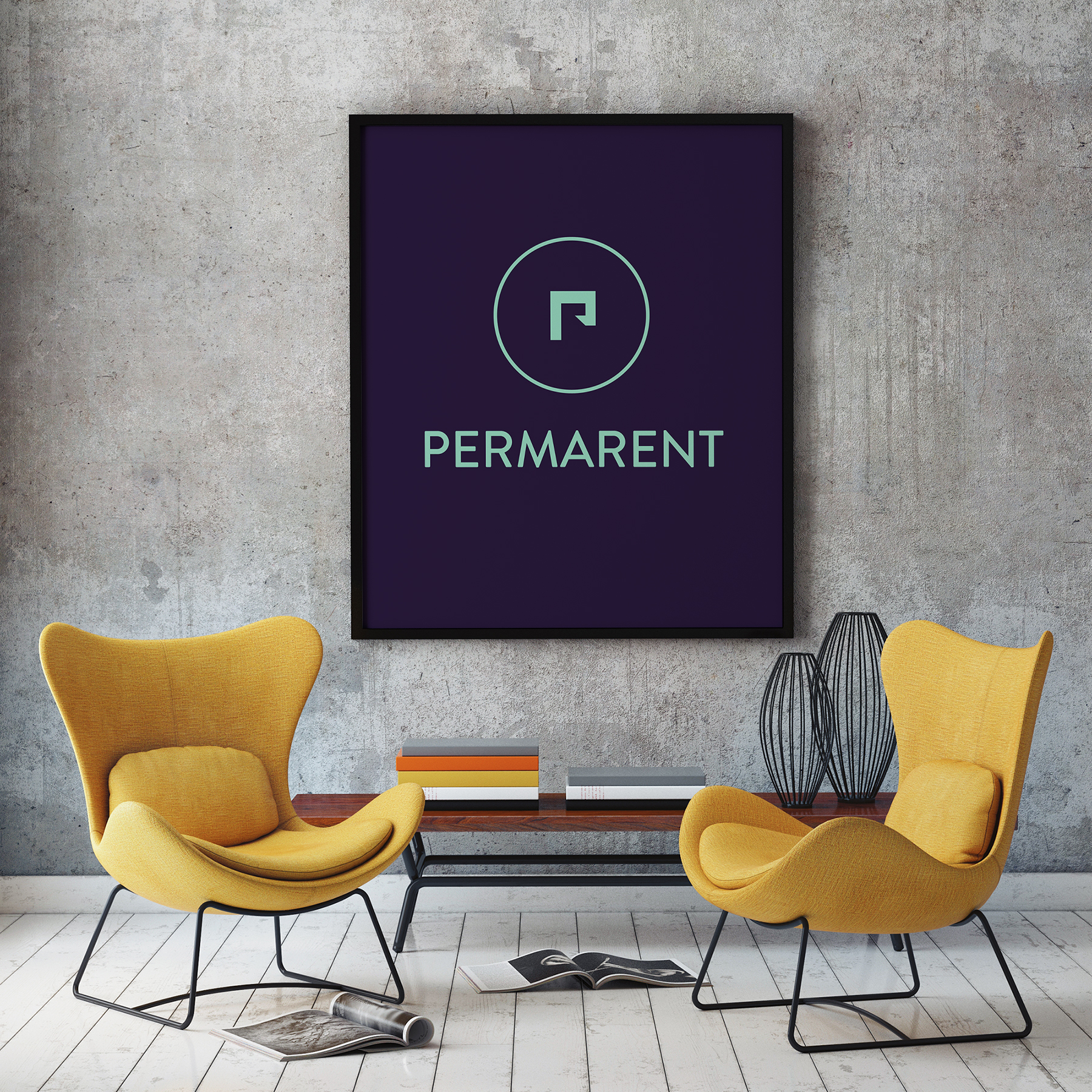
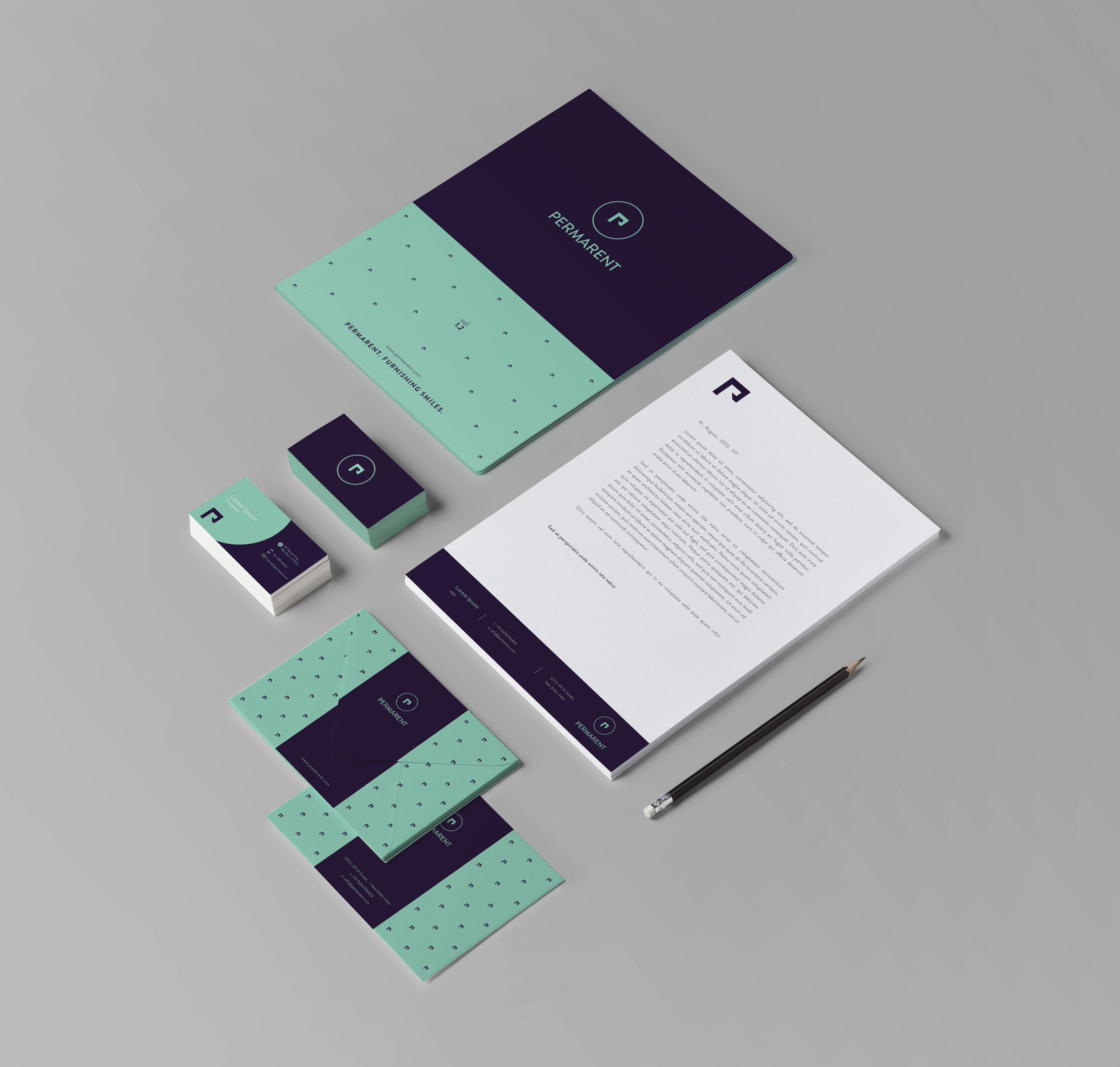
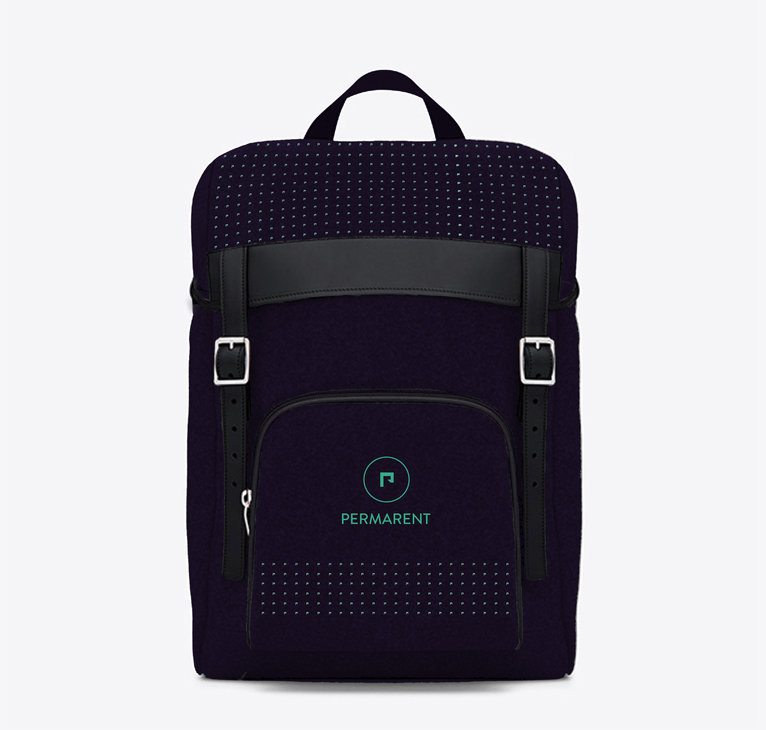
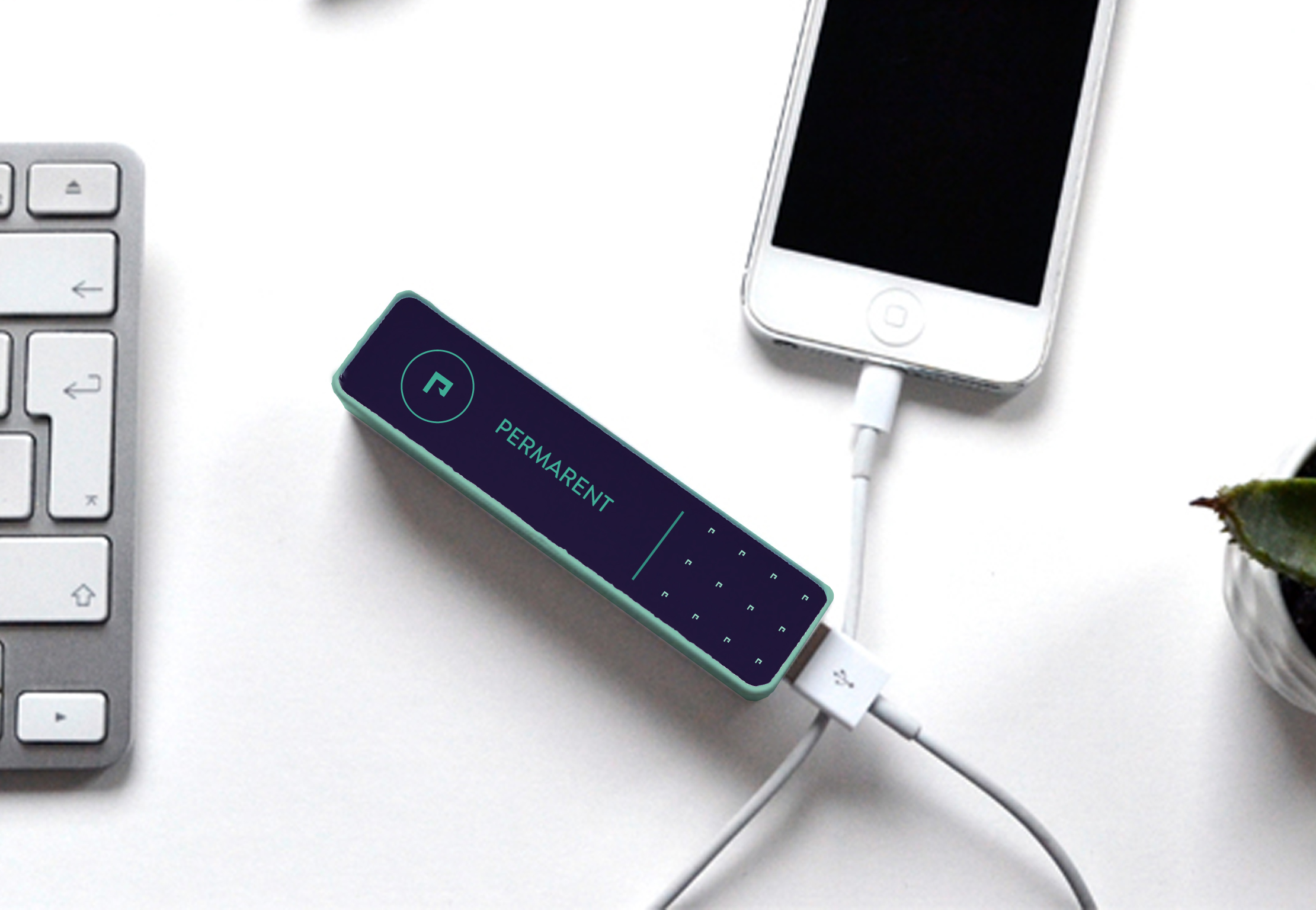
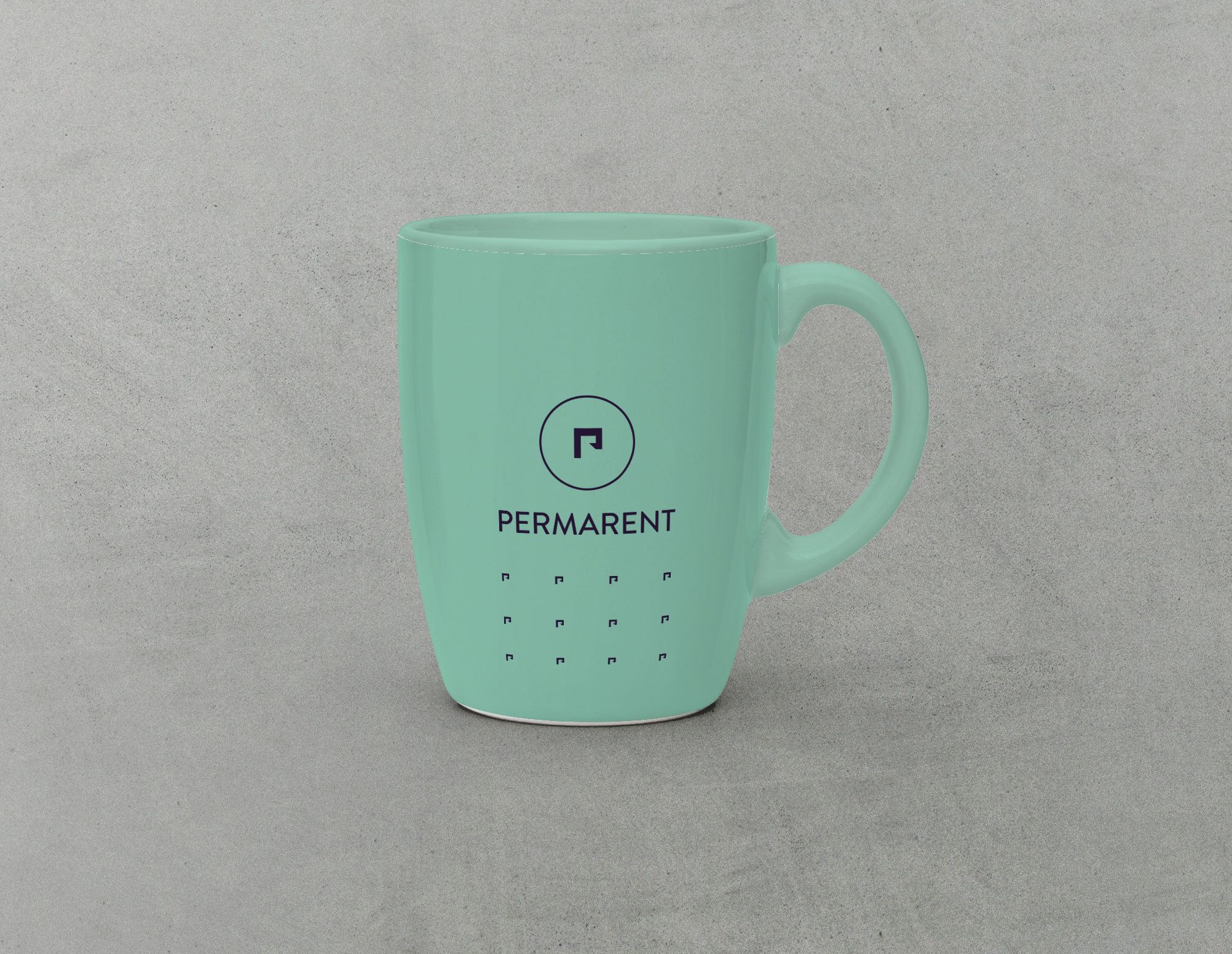
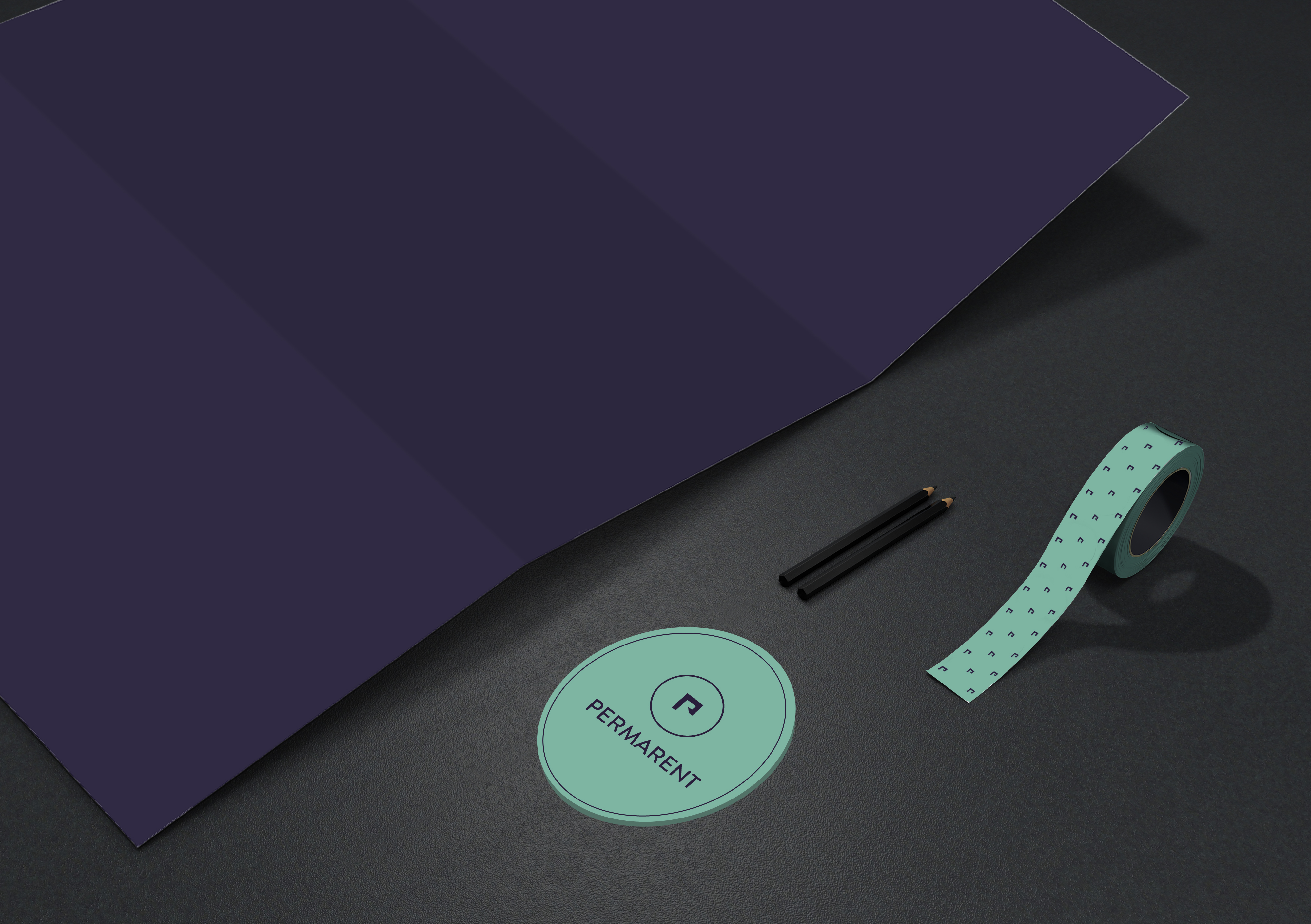
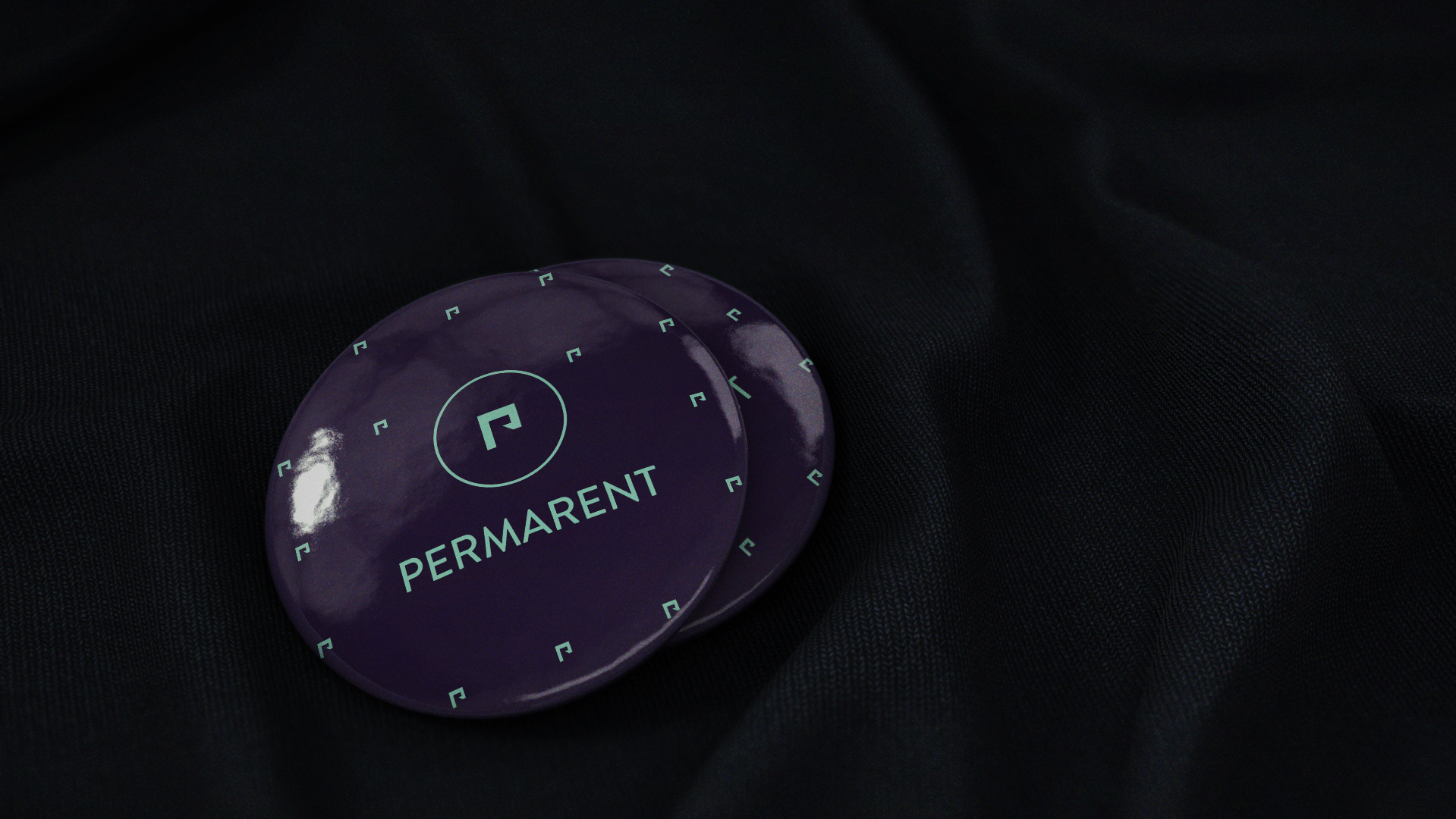
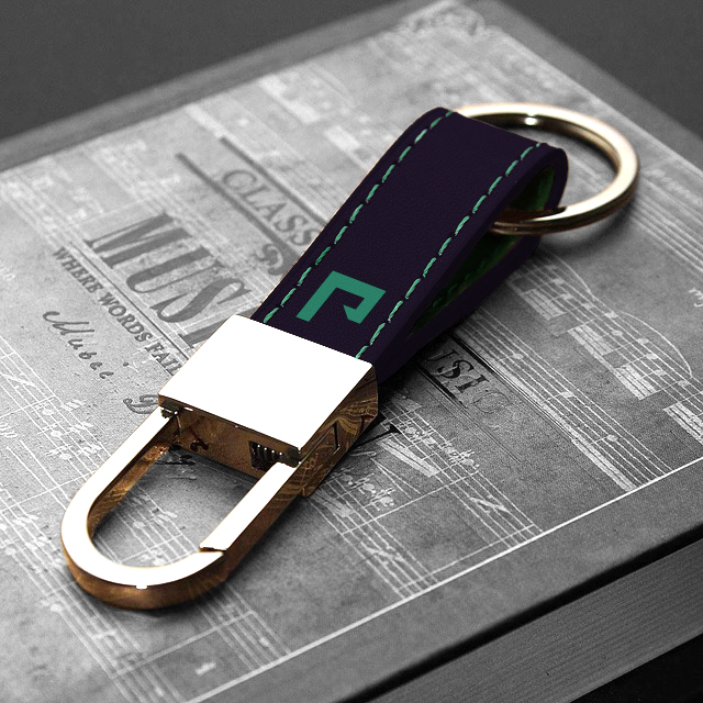
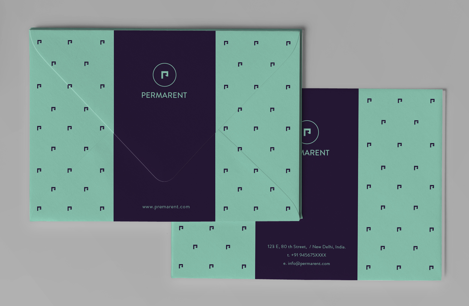
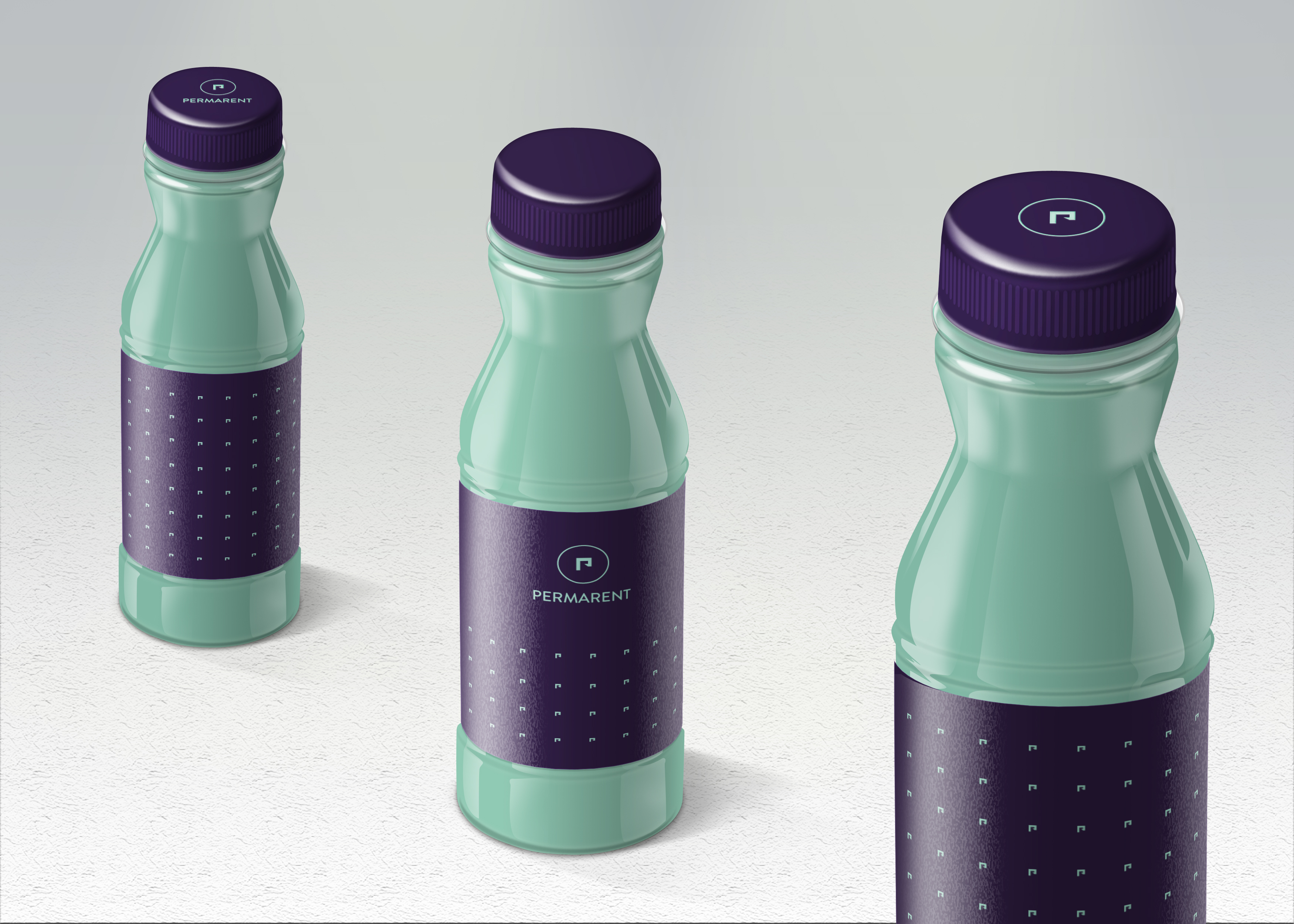
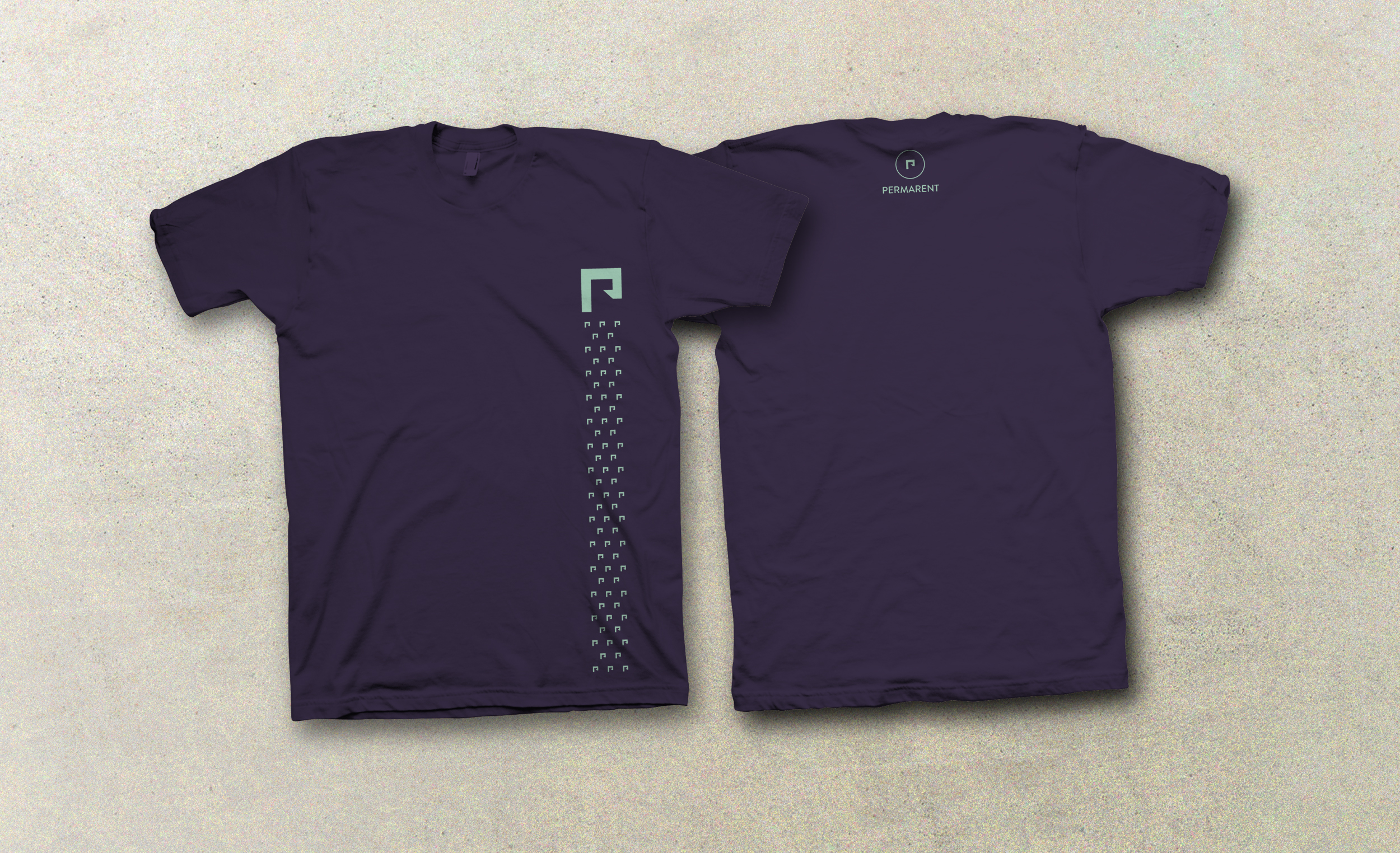
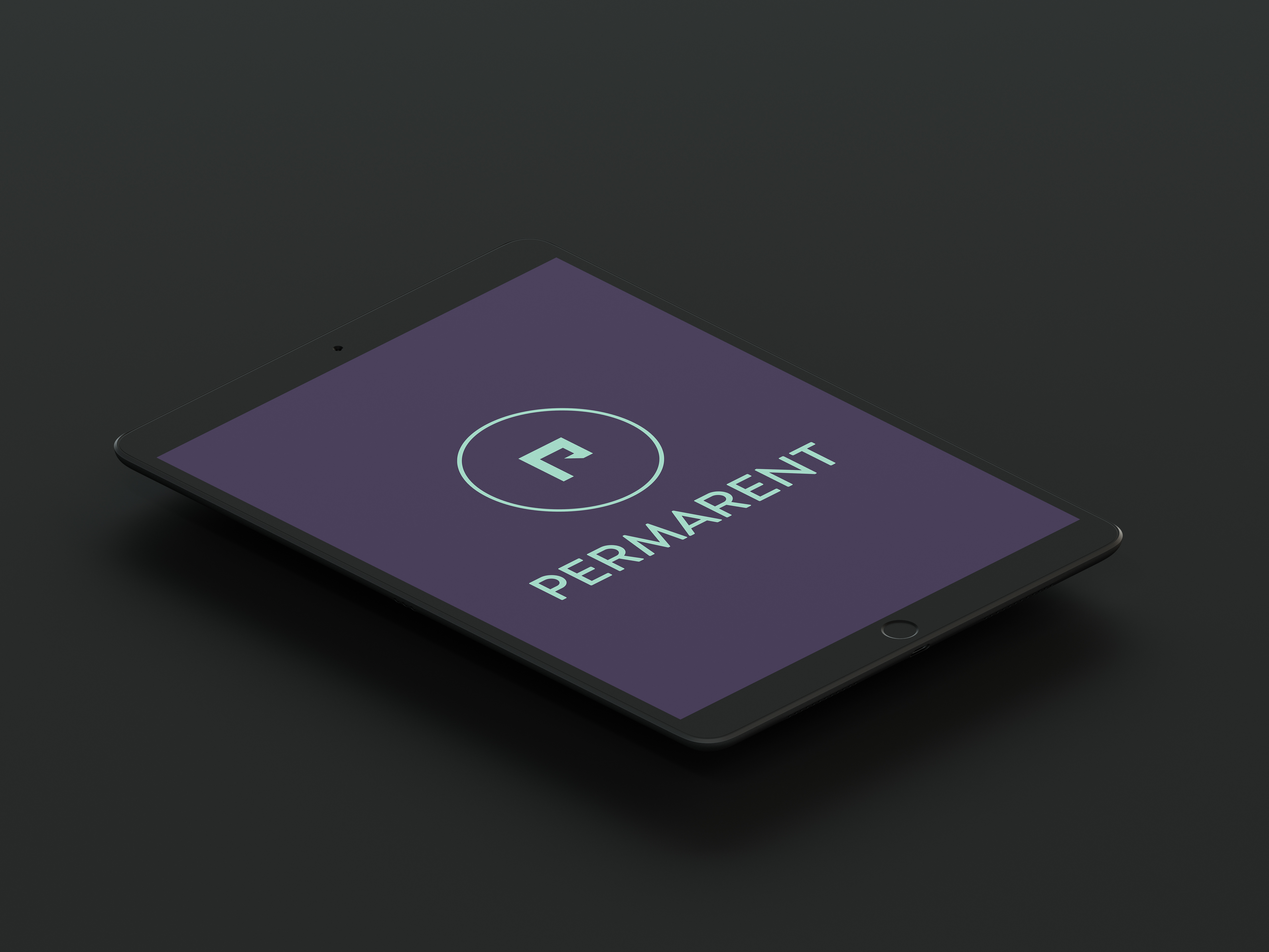
The team underwent a rigorous design thinking process to create a minimal yet stimulating brand identity.
- Brand Identity Design
- Stationary, Packaging and Merchandise Design
- Offline Activations and Brand Partnerships
The logo uses line art to create the outline of a confined and inviting space while keeping the initial 'P' as a part of the design.
Given renting over owning is a newer market trend and comes with its own set of adoption challenges, we used the colour purple to associate the concept with royalty and respect. Also, as the brand caters to personal and professional spaces, mint was incorporated to promote feelings of tranquillity and calm.
All in all, the new identity helped give the brand a creative and imaginative outlook along with increasing the level of consistency and brand recall.
