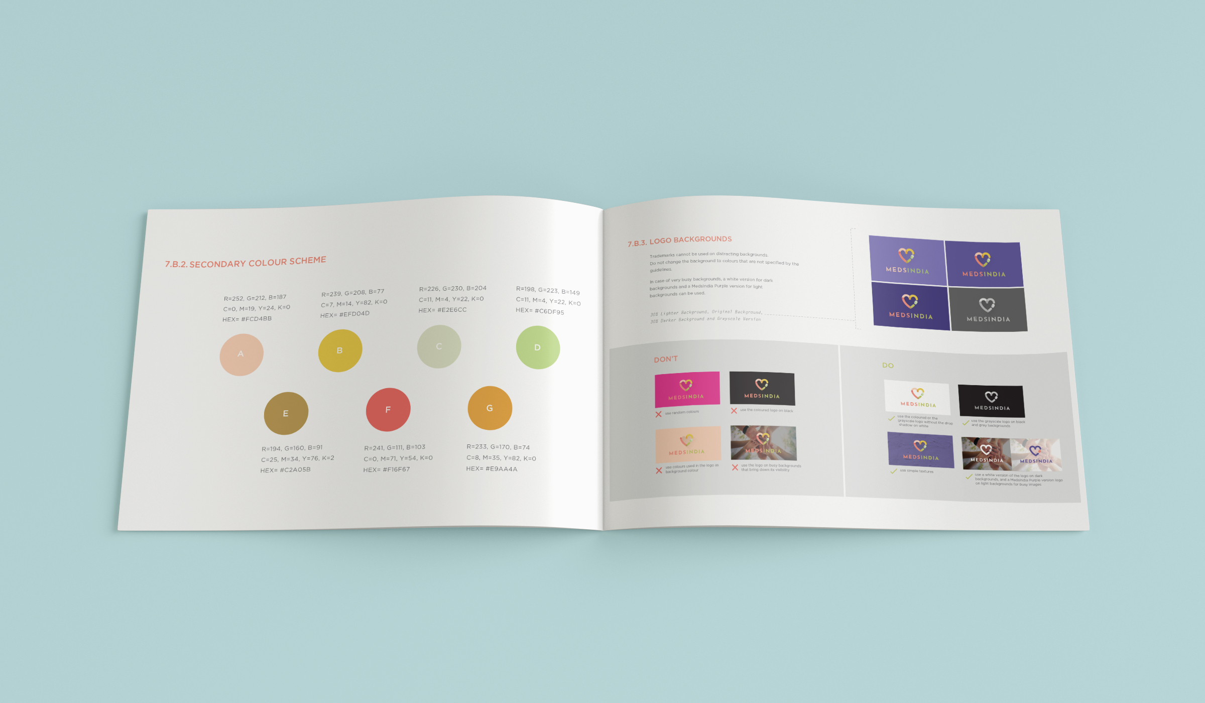
We helped build the Global Brand Guidelines for MedsIndia by deep diving into the market trends, competition and the target audience. The purpose of the exercise was to differentiate MedsIndia from other brands, gain higher customer recognition and make a consistent brand identity.
- Brand Identity and Strategy Development
- Formulating Global Brand Guidelines
- Digital Marketing
- Offline Tie-ups and Engagement
The branding displays freshness, heritage and hope. The logo comprises of 'm' and 'i', the brand initials brought together to make a heart, giving out the feeling of love and care. It can also be perceived as an index finger and thumb holding a pill. In addition, the colour palette and distinctive shape makes the logo easily identifiable.
Furthermore, we undertook digital marketing and offline events and associations for the brand. Rather than focusing on fear, we wanted to build the brand on hope and care.
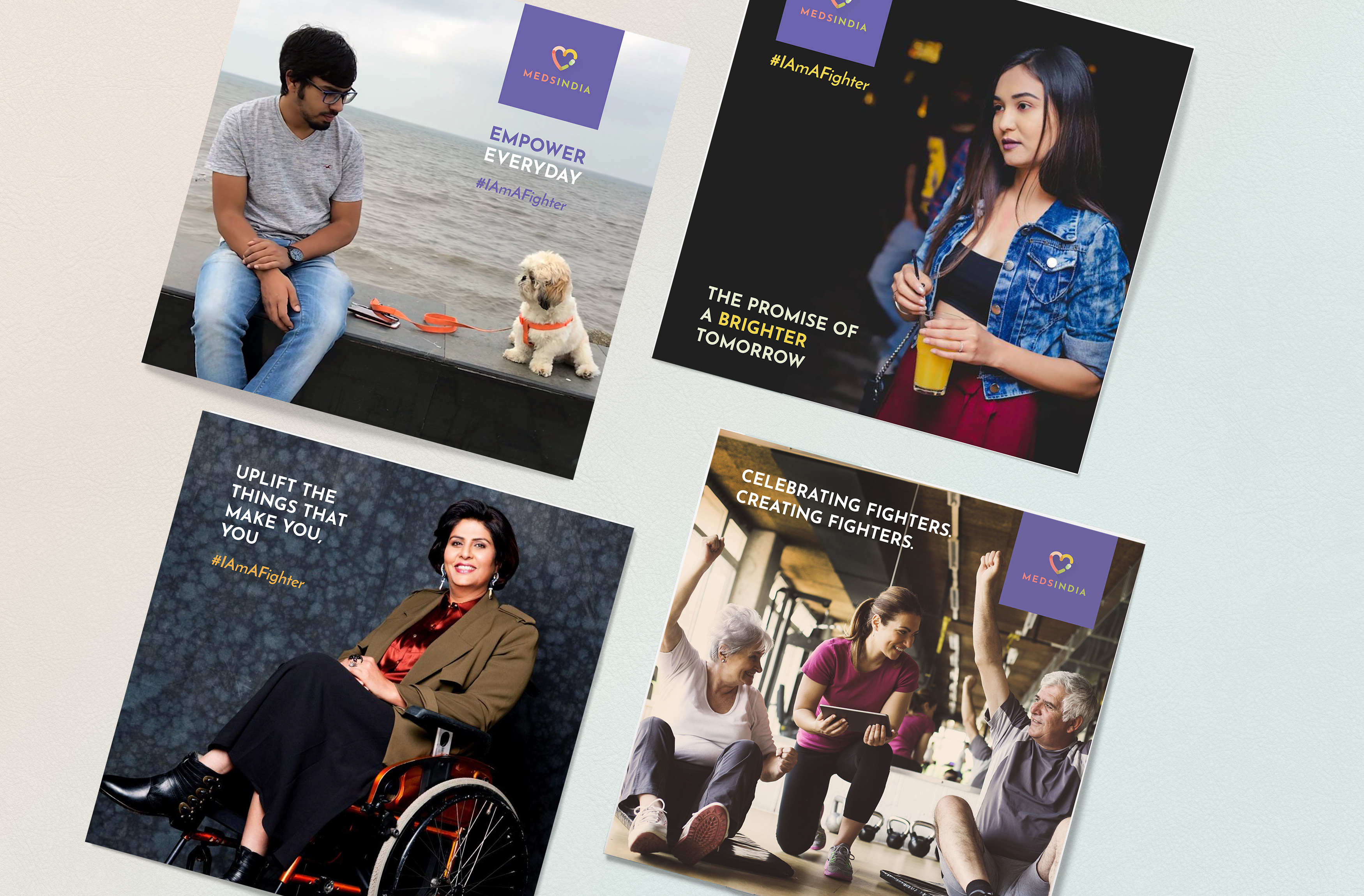
Keeping in line with the brand foundation, our lead digital campaign- '#IAmAFighter' celebrated fighters across careers, ages and lifestyles. From bloggers and DJ's to engineers and entrepreneurs, people came together, shared their fighter stories and empowered others across the country.
